
Adstasy: an animated landing page that stays light
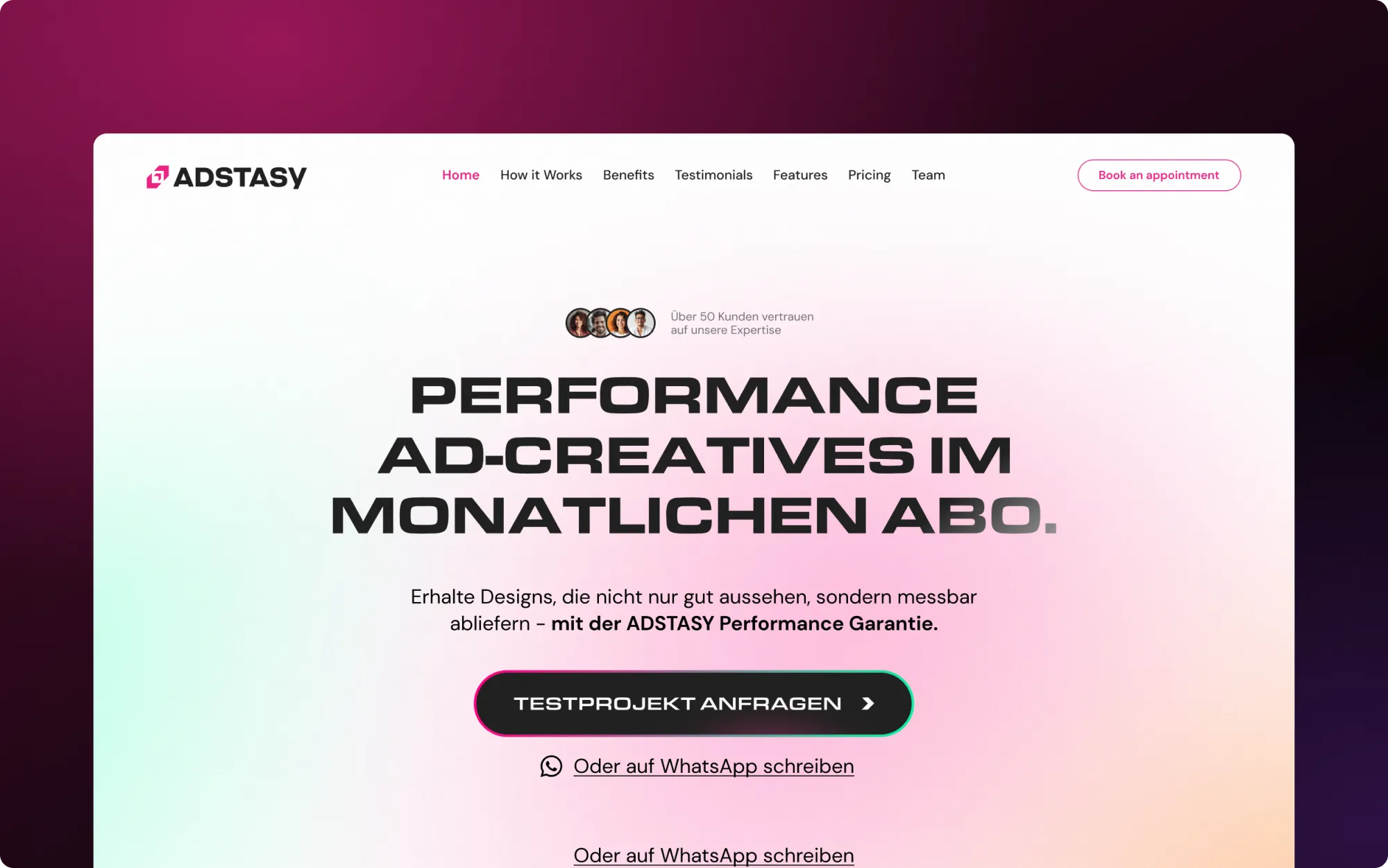
About the project
Adstasy sells performance ad creatives on a monthly subscription, and its old website lacked energy and did not reflect the value of the brand. Roman Savchuk turned a Figma design into a single Webflow landing page where the animation is part of the pitch, while keeping the page light and easy for the client to edit.
Key Takeaways
- Animation as the pitch. One landing page, built from a Figma file, where the animation is part of the pitch.
- A full motion stack. Smooth scroll, hover states, interactive CTAs, Lottie and micro-interactions, with GSAP and custom JS behind them.
- Light while it moves. Page weight and speed were kept in check while the effects were added, not afterwards.
- Safe to edit. The page is structured so the client can edit content without breaking the design.
What the page had to do
The client sells ad creatives, so a flat page would work against them. My job was to turn the Figma design into a page with energy, and to do it without the usual price of a motion-heavy build: a heavy page that is awkward to edit.
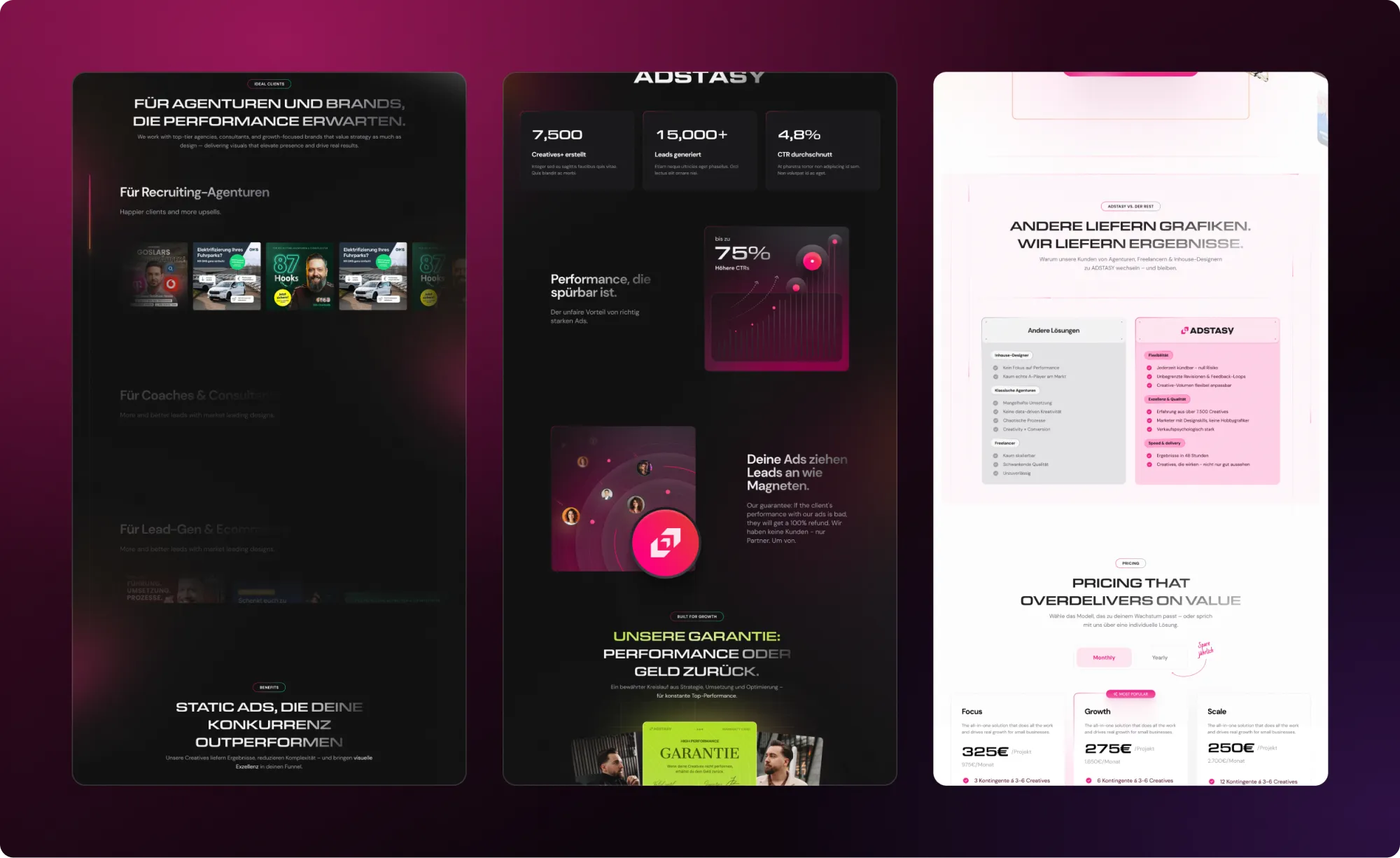
Responsive layout first
I built the responsive layout first and checked it across devices, so the animation could be added to a base that already behaved on small and large screens.
Interactions: scroll, hover, CTA
Smooth scroll sets the pace, hover states give elements feedback, and the CTAs are interactive rather than static. GSAP and custom JS cover what native Webflow interactions do not reach. The point of each is simple: the visitor should feel the page reacting and be nudged toward the CTA.
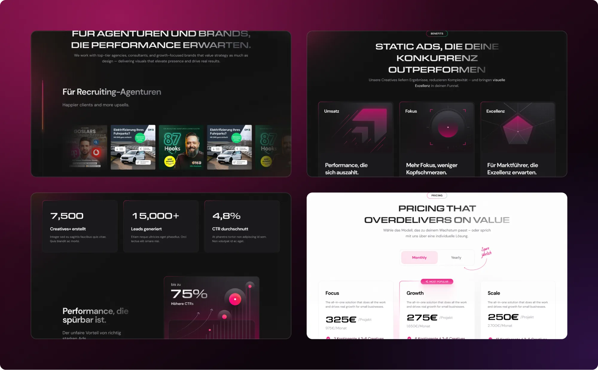
Lottie and micro-interactions
Lottie handles self-contained illustrated motion, and micro-interactions fill the space between the larger effects. Each one had to justify its weight in the page.
Built so edits do not break things
Because the page will keep changing, I arranged it so that editing one block does not disturb its neighbours or the overall design. The client can update it without me.
Speed and SEO
I tuned speed and basic SEO at the end of the build, with all the motion already in place, so the numbers reflect the page as it really ships.
Outcome
The page shipped as a polished single-page build. According to the client, engagement jumped and new customers arrived in volume within the first month.

FREQUENTLY ASKED QUESTIONS
01How do you add Lottie and GSAP to a Webflow landing page without making it heavy?

Choose effects that earn their weight, build the responsive layout first and measure speed with the motion in place.
02What is the benefit of interactive CTAs?
They respond to the visitor, which draws attention to the action the page wants the visitor to take.
03How do you make a Webflow landing page safe to edit?
Structure it so that content changes do not affect the design system around it, which keeps the page consistent after updates.
04Why build the layout before the animation?
Because motion that sits on a weak layout breaks first on small screens. A responsive base makes the effects reliable.
05When do you check speed on an animated Webflow page?
With all the animation in place, so the result reflects the final page and not an early draft.